Redesign of an Internal Application
Redesigned an internal tool to improve usability and reduce documentation errors. Addressed lack of branding, unclear workflows, and poor user guidance
Explore the complete process on 
My Role
- Worked as the only UX/UI designer.
- Styled outdated UI using CSS, HTML, and Angular.
- Worked as a UI developer to implement changes.
Design Process and Tools
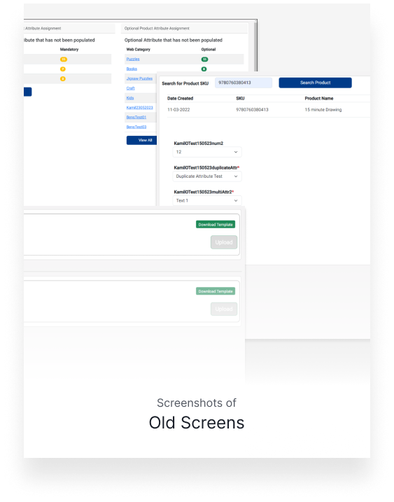
- Captured screenshots of all existing screens.
- Mapped user flows for various application functions.
Outcome With Metrics
- Achieved an 80% reduction in errors.
- Improved consistency in documentation by users.
User/Business Problem
- Application did not follow the brand style guide.
- Lack of clear messages and user instructions caused confusion.
- Incorrect usage led to inconsistent documentation across systems.
- Manual data entry was error-prone and inefficient.
Design Process
- Captured and documented all existing screens of the application.
- Mapped out user flows to understand current pain points and confusion.
- Identified UI inconsistencies and lack of feedback that impacted usability.
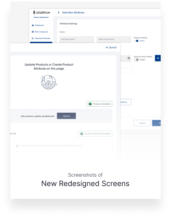
- Created wireframes and redesigned screens using Figma with a focus on clarity and alignment to brand guidelines.
Impact & Results
The redesign led to an 80% reduction in errors during product list uploads, significantly improving data accuracy and consistency across internal systems. Enhanced UI clarity and clear guidance helped users complete tasks with confidence, reducing confusion and support requests. Overall, the usability and efficiency of the internal tool improved noticeably, despite the limited development resources.