Basket Overlay Redesign
Enhanced the shopping experience by making the basket overlay more intuitive, informative, and conversion-friendly across devices.
Explore the complete process on 
My Role
- I worked as the lead UI/UX designer.
- Redesigned the basket overlay and improve usability and improve the accessabilty.
Design Process and Tools
- Conducted competitor analysis, user flows, and other UX research using Miro.
- Fidelity designs and design handoffs were completed in Figma.
Outcome With Metrics
- Improved engagement with the basket overlay on the website.
- Increase in average order value.
Problem
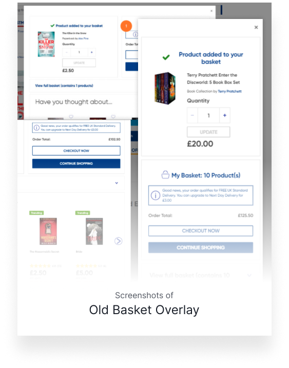
The original basket overlay had several usability issues that disrupted the shopping experience:
- Lack of clarity around free standard delivery: There was no messaging or visual indicator to inform users about how close they were to qualifying for free delivery.
- Overwhelming layout: The overlay displayed too much detail in a cluttered way, making it hard to scan.
- Hidden items: Previously added products were collapsed under a dropdown, which users often missed.
- Disruptive positioning: The basket popup appeared in the center of the screen, blocking product visibility and stopping users from exploring further.
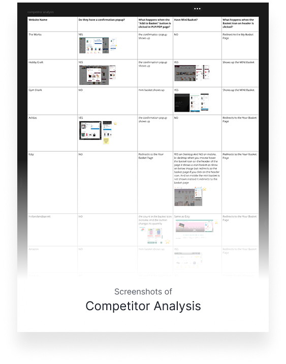
UX Research
- Conducted competitor analysis to examine how leading e-commerce platforms designed their basket overlays.
- Explored common interaction patterns and usability guidelines to inspire effective layout and functionality.
- Analyzed user behavior with tools like Microsoft Clarity and Hotjar to identify frustration points and drop-offs.
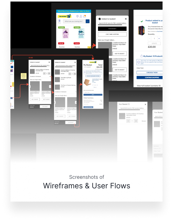
Wireframing & Collaboration
- Created detailed user flows to map out the entire basket interaction journey.
- Explored and iterated on multiple versions of the basket overlay to test different layouts and interactions.
- Collaborated closely with products owners to choose the most effective approach.
- Used wireframes to run initial reviews and gather early feedback from internal teams.
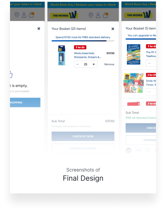
Final Design & Handoff
The redesign delivered measurable improvements in both usability and business outcomes:
- Designed high-fidelity UI based on the chosen wireframe direction.
- Developed the complete user flow covering multiple scenarios, including mobile, desktop, and edge cases (e.g., empty basket, full basket, delivery threshold not met, etc.).
- Defined clear acceptance criteria for each use case to support development and QA during implementation.
- Participated in design reviews of the developed interface to ensure visual and functional alignment.
- Provided final sign-off after validating the live implementation matched the design specifications.
Impact & Results
The redesigned basket overlay increased average order value by highlighting free delivery incentives and improved the mobile shopping experience with a cleaner, more intuitive layout. It also reduced customer support queries related to basket and delivery issues.